Saturday, April 2, 2011

XX. Give Art on Christmas Day


I mean, we’re right smack in the middle of the Christmas season, and all we can talk and think about are grimy old houses that have seen better days, dusty aparadors that still smell of the sweaty undergarments of our great grandparents, and the possibility that orbs in photos of salas and bedrooms might represent the spirits of previous residents. Pathetic.


So here’s the perfect foil to all that: For many years now, my family has (have, in, er, British English) sent out Christmas cards to friends and acquaintances every year. However, it was not until a bit more than three years ago that we hit on the idea of commissioning an original artwork for our card, such that each of the few hundred recipients would have a limited-edition print of an original work of art in hand, which would surely be a high-priced collectible many years from now. Or so we hope.


We also decided that we would, as far as possible, commission work from young (generally taken to mean, below forty years old) artists, and preferably those from our home province of Bulacan. So here’s how things have progressed since then.


* * * * *


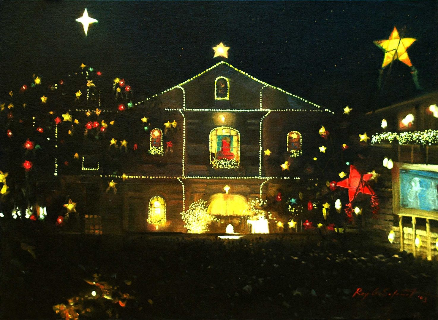
In mid-2003, we met thirty-three-year-old Rey G. Salamat, from Malolos’ neighboring town of Paombong. A member of the Lakan Sining ng Bulakan and other art associations, Rey was also an instructor in drafting at the Bulacan State University. At that time, he had recently mounted a successful two-man exhibition, “Renaissance,” at the Hiyas Museum in Malolos. He came highly recommended, and had a reputation for being a prolific artist whose studio was usually filled with numerous commissions-in-progress.

The Christmas card artwork that Rey did for us was entirely his own choosing – we did not specify the subject. The result, “Simbang Gabi sa Las Piñas” was unusual in its predominant blackness, yet much-admired by both family members and card recipients.


* * * * *

In the desire to become even more overtly Christian in representation, the following year, we commissioned another young artist, twenty-nine-year-old Maria Socorro Cervantes Tuble, to do a Nativity scene. (Although from Manila, we figured that being female, and in the spirit of affirmative action, she could be exempt from the Bulakeño requirement.)


Susie is an artist and interior designer who dabbles in different art media, particularly in charcoal and oil. She began drawing at a very early age, which was fortified with formal training in charcoal painting. She then participated in oil painting workshops at the University of the Philippines College of Fine Arts and at the Ayala Museum. She graduated from the Philippine School of Interior Design and is also an interior design consultant. Both her design office and studio-gallery are at #6 Bascom Street, North Fairview, Quezon City.


Susie is a great admirer of the Renaissance masters, an influence evident in her liturgical artworks for churches, and in her other private commissions, including the 2004 Christmas card she did for us, “The Adoration of the Shepherds.”


* * * * *


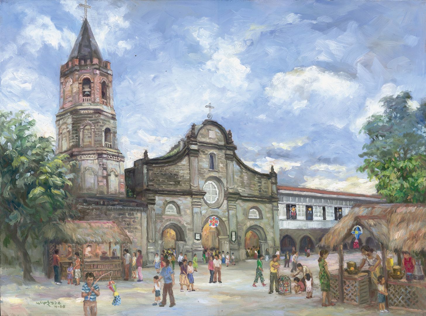
We had known the Hagonoy, Bulacan artist Wilfredo B. Reyes for a number of years, as he had done artworks to my family’s commission previously. Willie is a Bachelor of Fine Arts graduate of the University of the Philippines at Diliman, where he majored in Painting. 


He had his first solo show at the Vargas Museum in UP in 1990, and has participated in numerous group shows including the juried “Pastels USA” 13th Annual International Open Exhibition in California in 1999. (Importantly, as the two of us were born in the same year, he automatically meets the criterion of “young.”)


Willie is a member of the Tabingdagat Painters of Hagonoy and the Guevarra Group of Artists. His home-workshop is at #0091 Ulandis, Mercado, in Hagonoy. He is best known for plein-air painting, wherein the artist works directly from nature. This is evident in the artwork that he did for last year’s Christmas card, “Early Christmas Morning in Barasoain,” which was an immediate hit with the vast majority of those who were privileged to receive it.


* * * * *

Casting our nets farther afield, while still trying to keep to the criteria of “young” and “Bulakeño,” a few months ago I was introduced, by means of state-of-the-art technology in long-distance textual and graphical telecommunications (i.e., the internet), to a then eighteen-year-old artist, Victor Tomas Banzon Ancheta, who had spent his childhood in Bulacan town, another of Malolos’ neighboring towns. (As we were later to find out, he and I even attended the same grade school in Malolos, although practically a generation apart – but in his time as in mine, the place was still run by the sternest Roman Catholic nuns this side of the Berlin Wall.)


Victor Ancheta migrated to the United States with his family when he was thirteen. Earlier this year, he graduated from the High School for the Performing and Visual Arts, an acclaimed secondary school in Houston, Texas, where he currently lives.


Victor is a conceptual artist, working mainly with sculpture, installations, and interactive art. He has exhibited in different art spaces, most notably at the Contemporary Arts Museum for the juried show, “Hit Me!” in 2005. He has earned numerous awards and recognition for his works. 


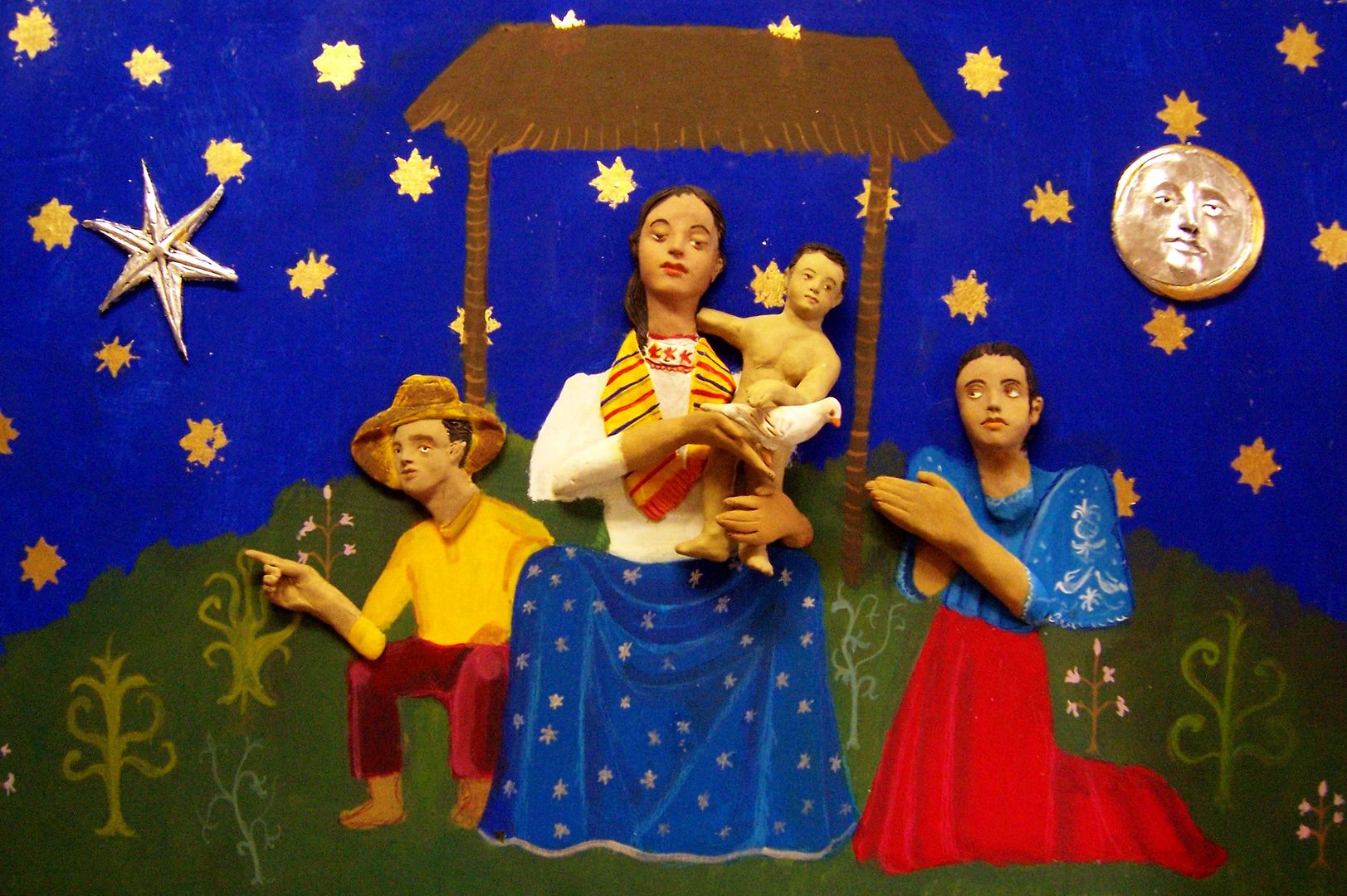
For our family Christmas card this year, Victor created “Ang Regalo” [The Gift], which unlike our previous Christmas card artworks is not in oil on canvas, and neither is it 18 inches by 24 inches in size. Instead, it is in a slightly eccentric 15 inches by 24 inches (which gave the printer some difficulty in making it fit the presumed "aspect ratio" based on our previous Christmas cards), and is in mixed media: wood, polymer clay, and gold and silver leaves.


As Victor explains, “‘Ang Regalo’ is a fusion of medieval and Filipino art resulting in a stylized rendering of objects rich in color and gilding. The Christ Child holds a dove, a symbol of peace, which can be interpreted as the Child’s gift to “Inang Bayan” (the Motherland), or a gift from Inang Bayan to the Christ Child.”


Because our Christmas card recipients had been so used to traditional themes and artistic styles in previous years, the artist’s “explanation” above, printed at the back of the card, helped “Ang Regalo” be that much easier to understand and appreciate, it seems. If you still don’t understand it, or just plain hate it, or really love it, please send Victor hate or fan mail, as the case may be, via his Multiply blogsite here. And visit victorancheta.com.


* * * * *


Another year, another Christmas card. So there. Any suggestions, nominations, or submissions for consideration for our 2007 Christmas artwork? Your feedback (via Personal Message if you prefer) will be much appreciated.


* * * * *


Merry Christmas and a Happy New Year!

Maligayang Pasko at Manigong Bagong Taon!


from the Veron-Dulay-Cloma Family of Bulacan and Manila, the Philippines


Originally published on 27 December 2006.  All text and photos copyright ©2006 by Leo D Cloma. The moral right of Leo D Cloma to be identified as the author of this work has been asserted.


Original comments:


victorancheta wrote on Dec 31, '06
I'm afraid to open my emails now. hehehe.

Happy Holidays Leo! Thank you so much for everything. Hope the feedbacks have been good.

rally65 wrote on Dec 31, '06, edited on Dec 31, '06
Merry Christmas and a Happy New Year again, Victor. Yes, feedback has been consistently good -- in the three previous years. For your card design, it has been, er, charitable! Ha! Ha!

arcastro57 wrote on Jan 2, '07
Wonderful Christmas art! Support your local starving artists! Have your cards designed by Victor! In 100 years, these cards will be family heirlooms, so I am keeping mine till they gather dust.

victorancheta wrote on Jan 5, '07
Ahaha. I knew that's was going to happen, that feedback would be rather dull. Nah, it's fine, it was a rushed job. :D


XIX. The Antique Police: Aparadors, Part Three -- Why Art Deco is really an underrated style (especially if you have some Tonka Trucks and a Sony HDTV).

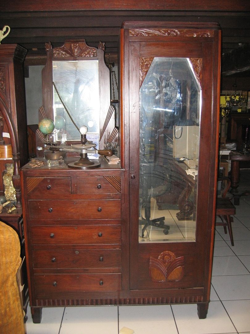
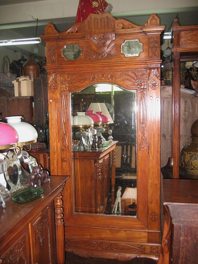
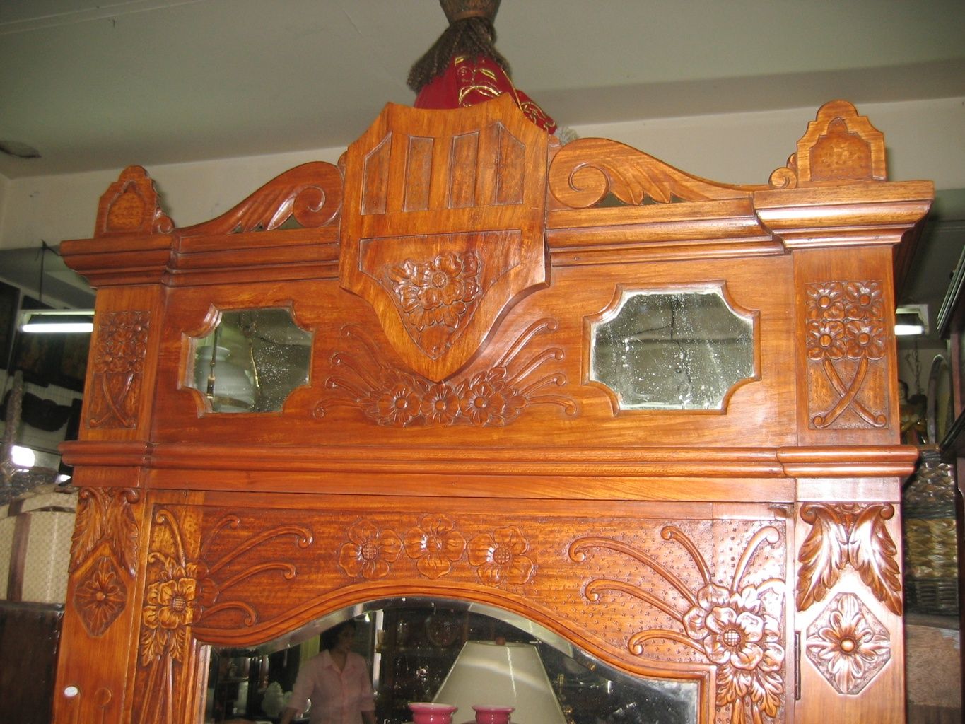
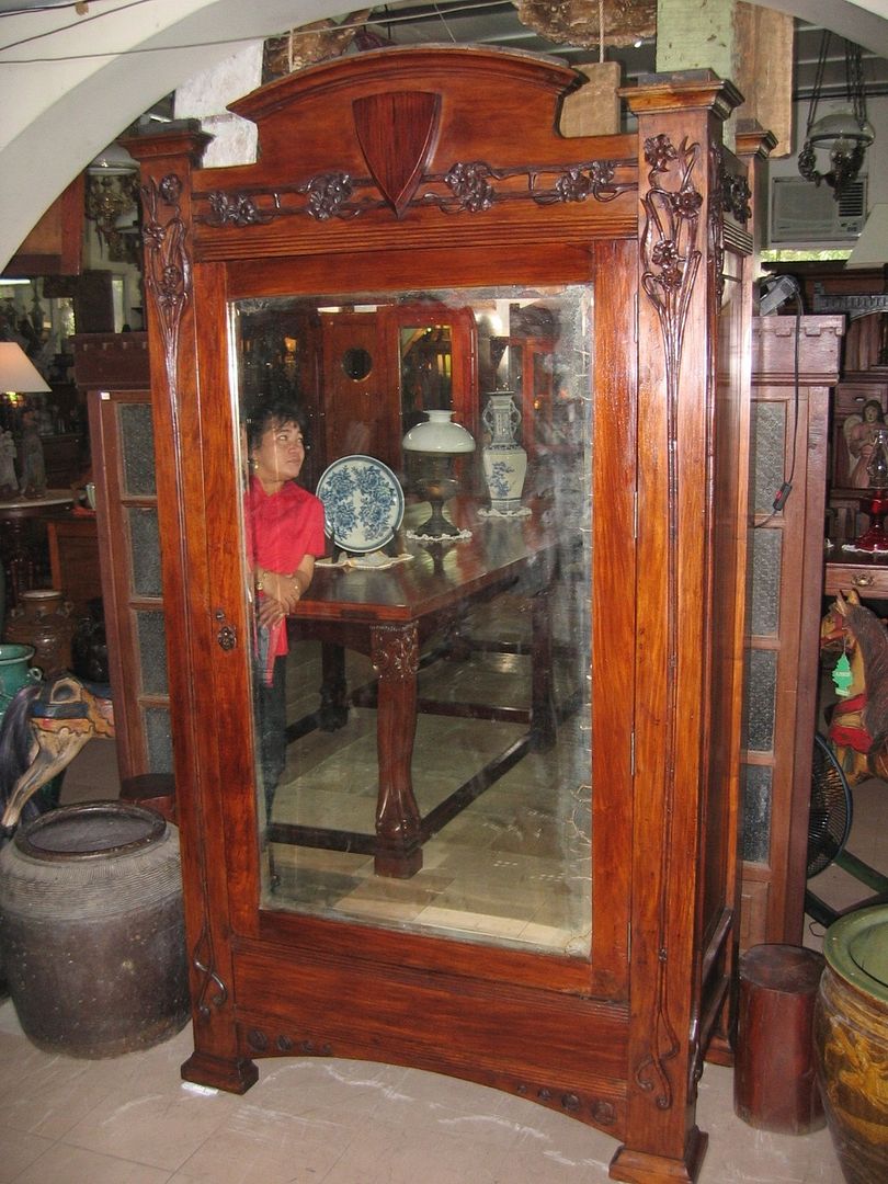
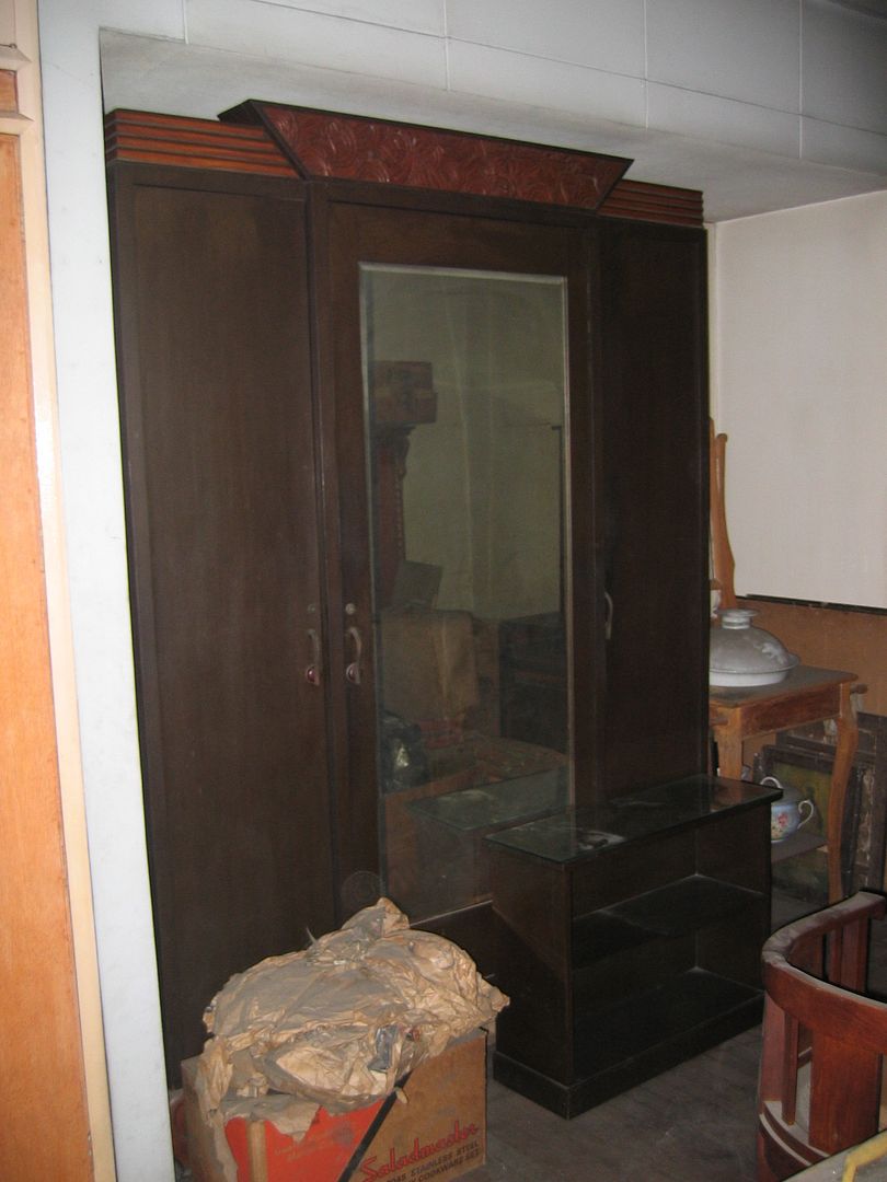
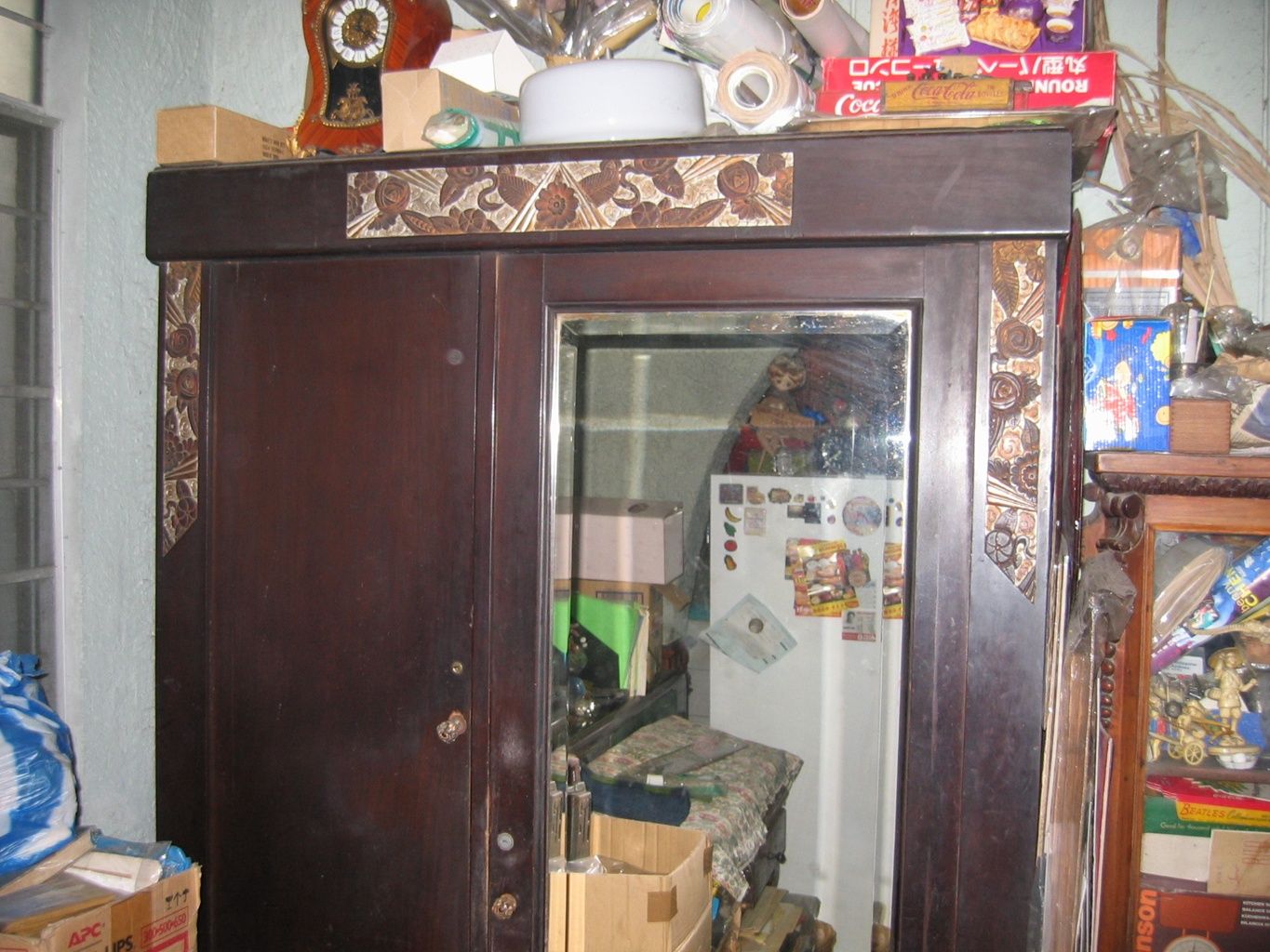
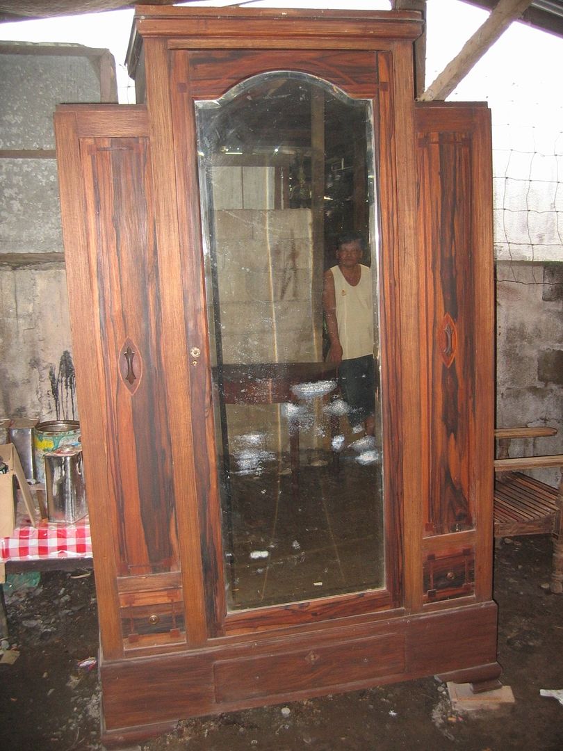
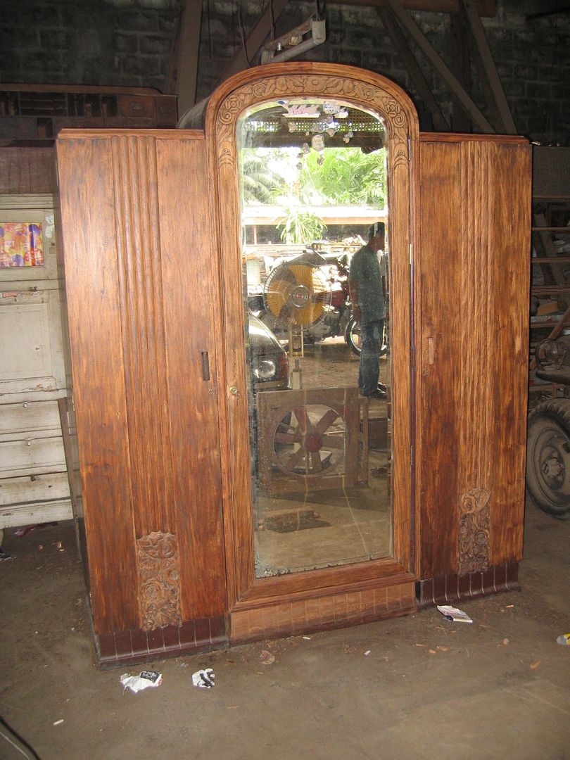
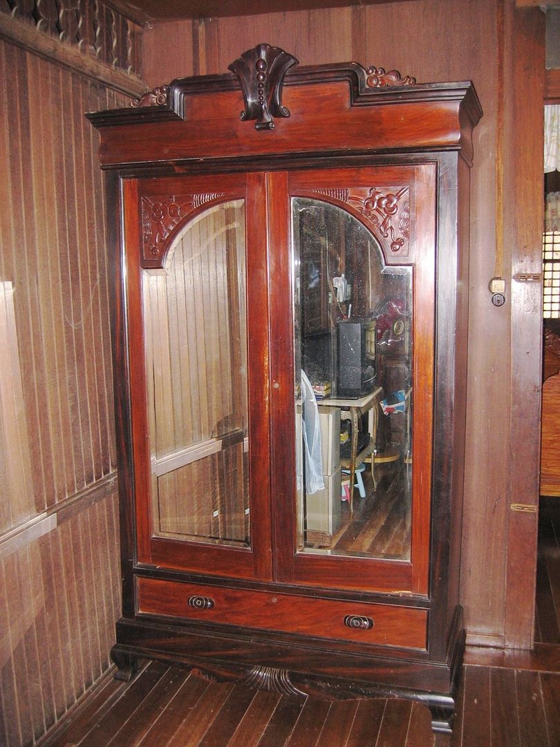
When we last got together, we looked at various executions of the “caballero” gentleman’s aparador. Here are two final examples of this type of wardrobe cabinet:


What makes these two specimens stand apart from the previous ones we saw is that they are noticeably different in design: straight lines, geometric shapes, severe angles, triangular forms, relative spareness of ornamentation. This, as readers who remember the Cirilo Santos House in San Miguel and our previous survey of Ambassador Sala Sets will recall, is undoubtedly the Art Deco style as applied to aparadors.   


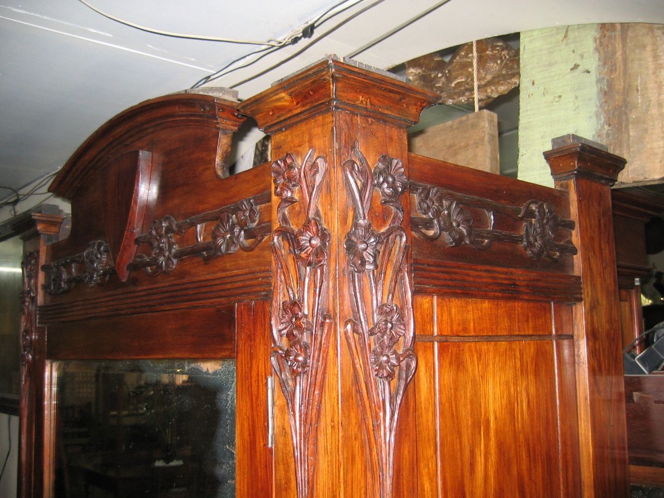
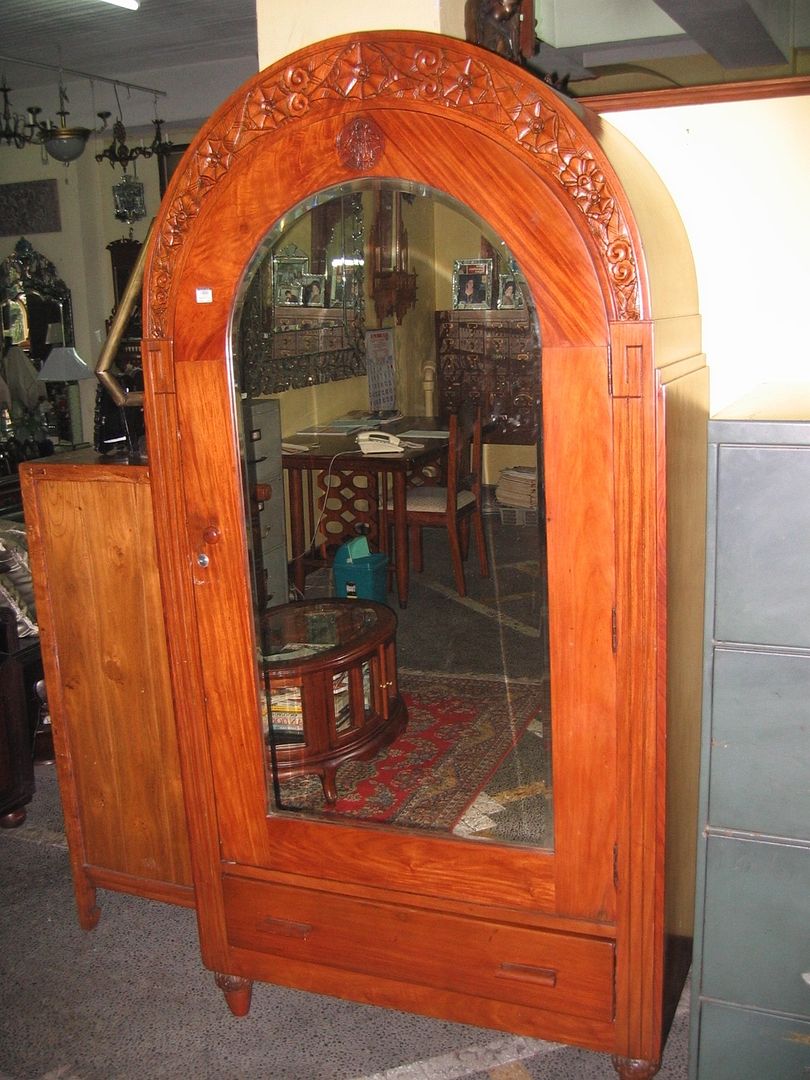
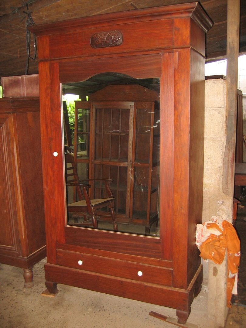
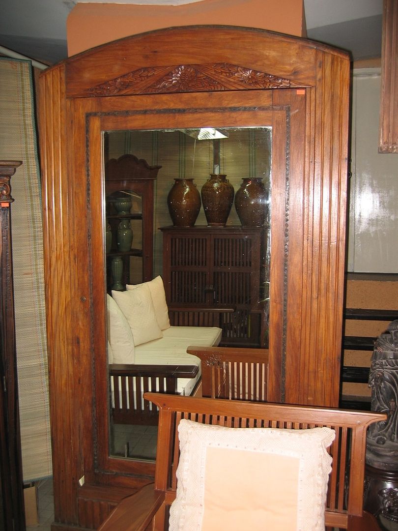
Just like with sala sets and entire houses, the Art Deco style for aparadors flourished in the 1930’s, and re-emerged during the Post-War recovery period in the late 1940’s to the 1950’s. Earlier examples are characterized by traces of the immediately previous Art Nouveau style, in many cases making it difficult to firmly classify specific pieces as definitely "Art Deco" or not. Here is an oversized single-door that has elements of Art Nouveau but strikes me as being Art Deco overall: 


This next one would be a truly superb example in my view, if it weren’t so short: 


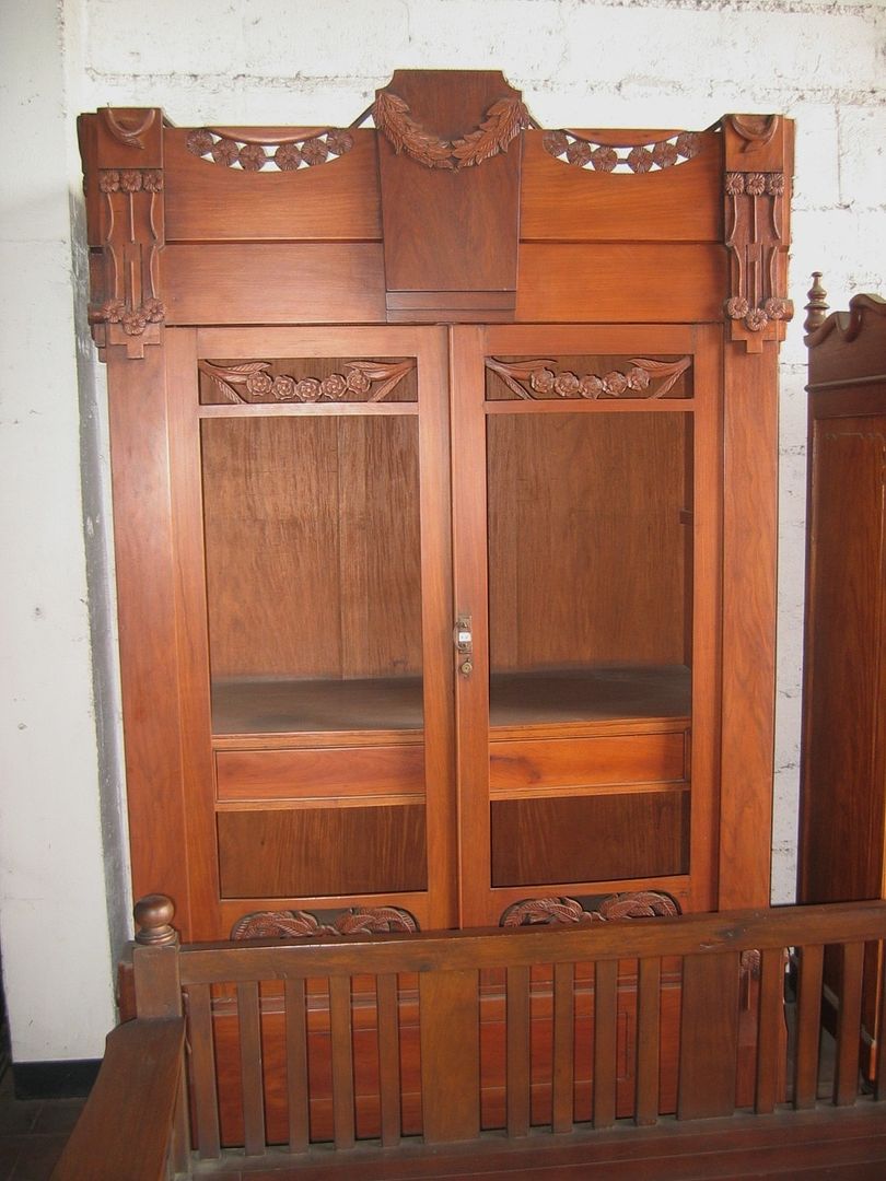
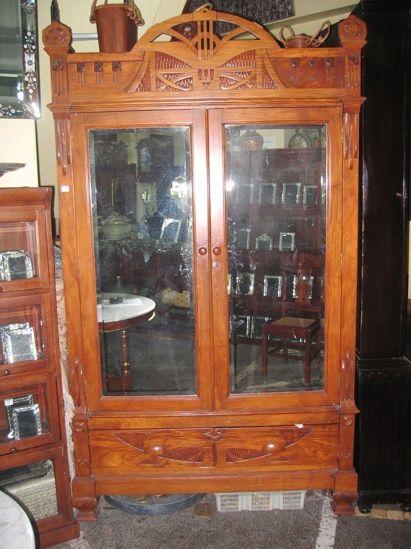
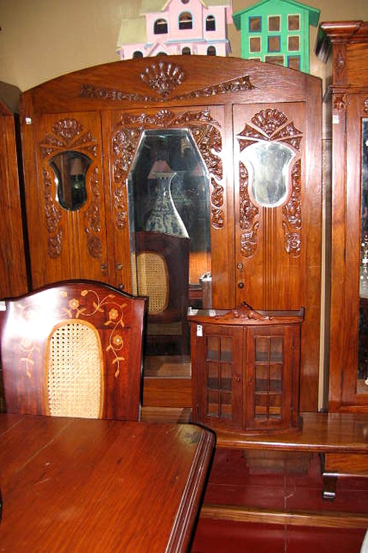
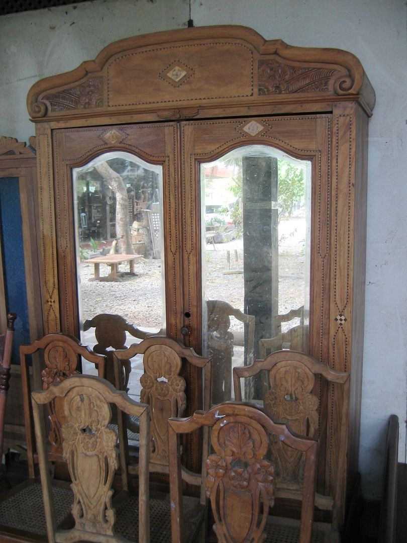
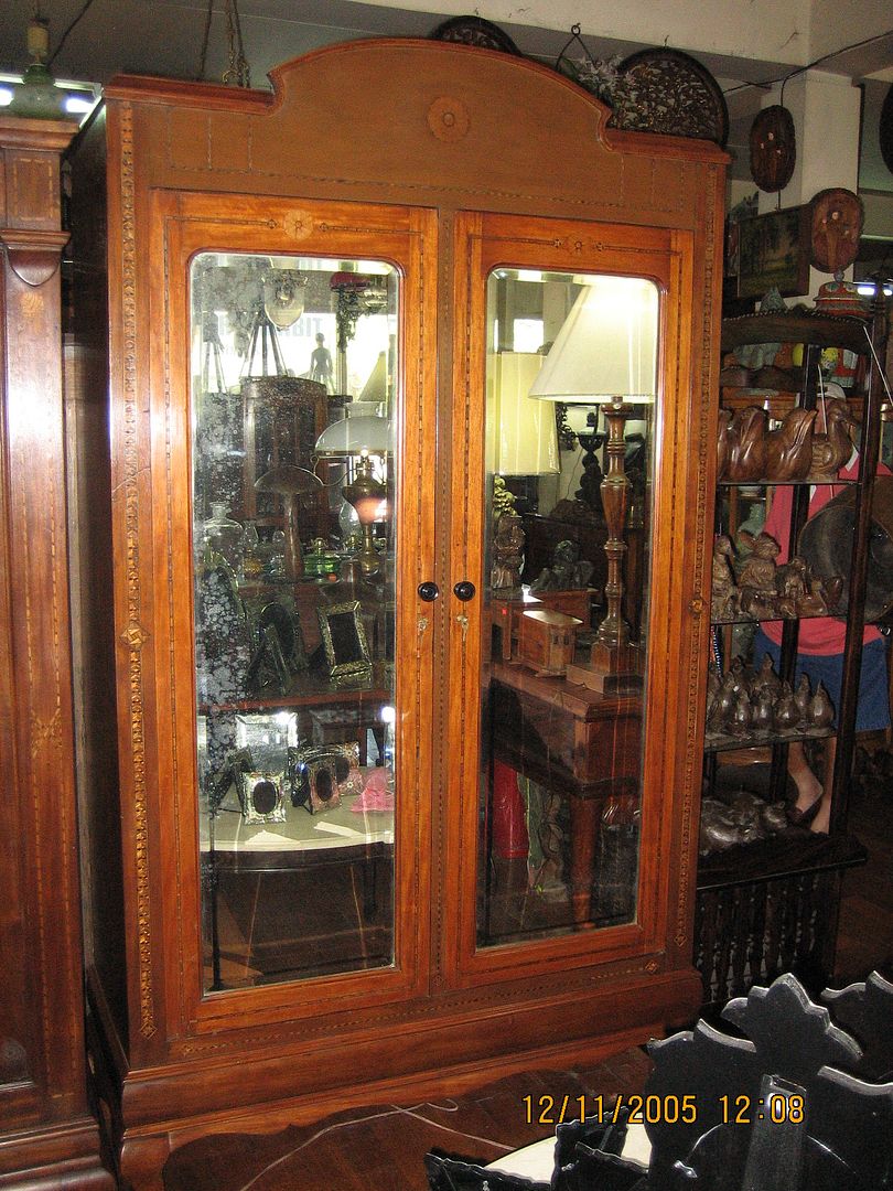
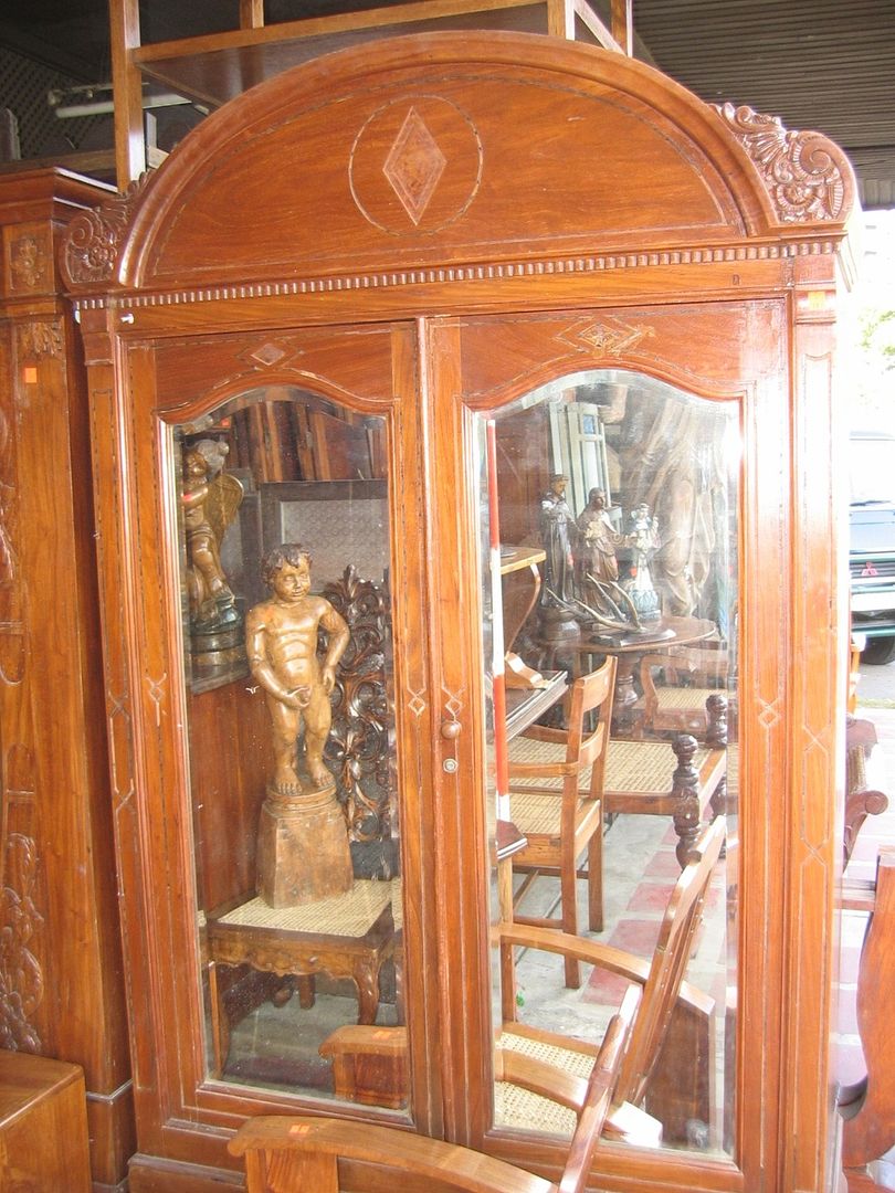
This kind of “garlanded Art Deco" style was even more commonly applied for double-door aparadors.   


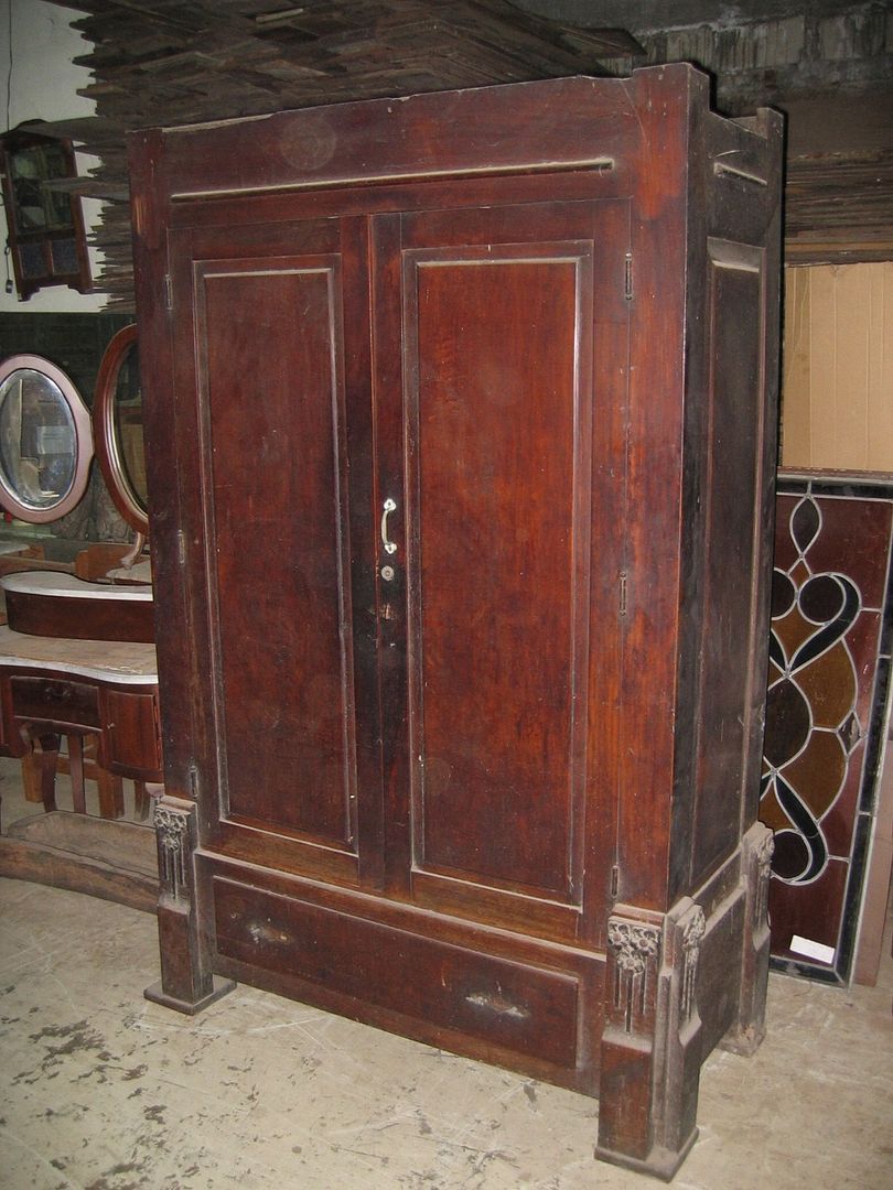
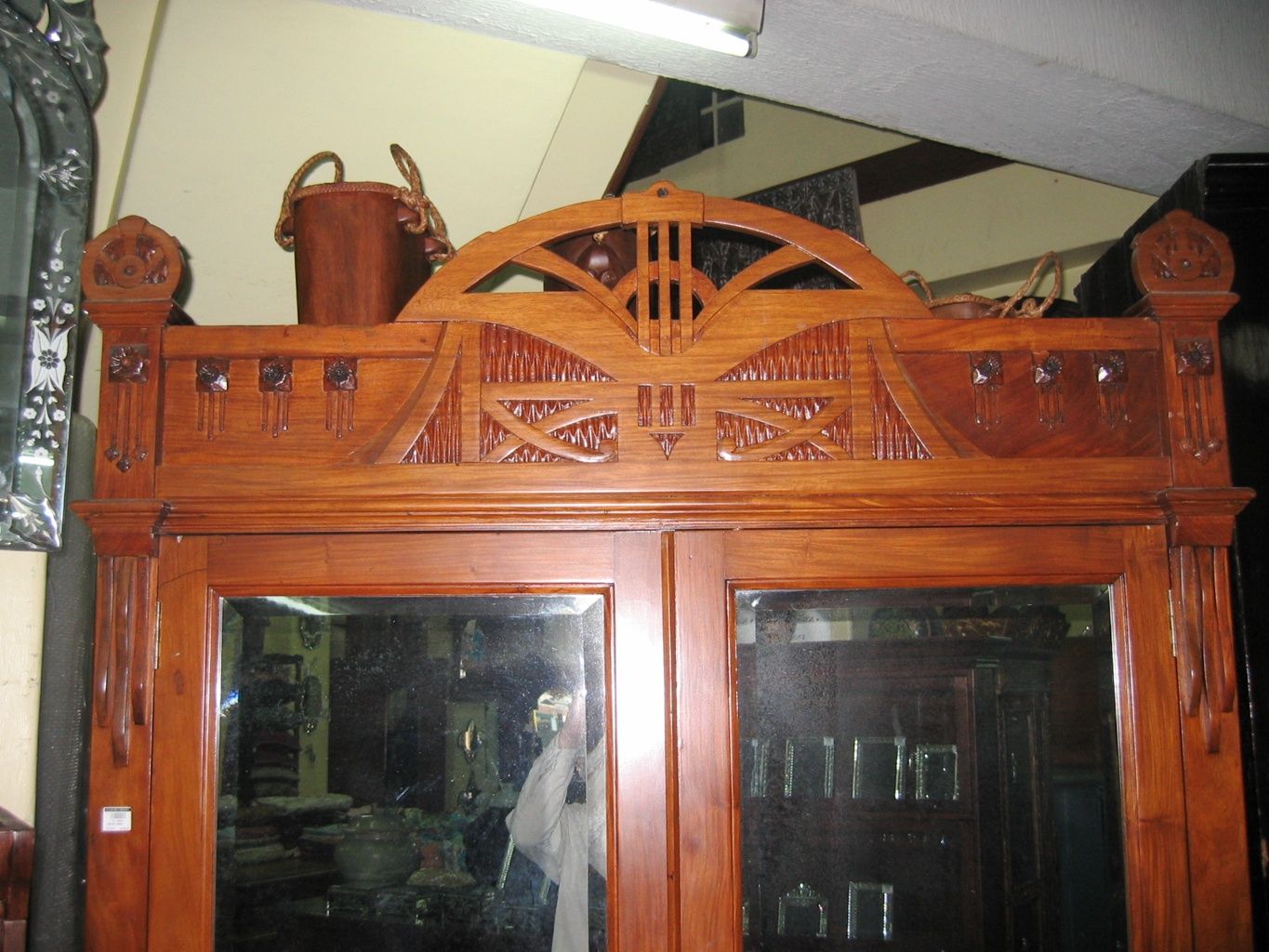
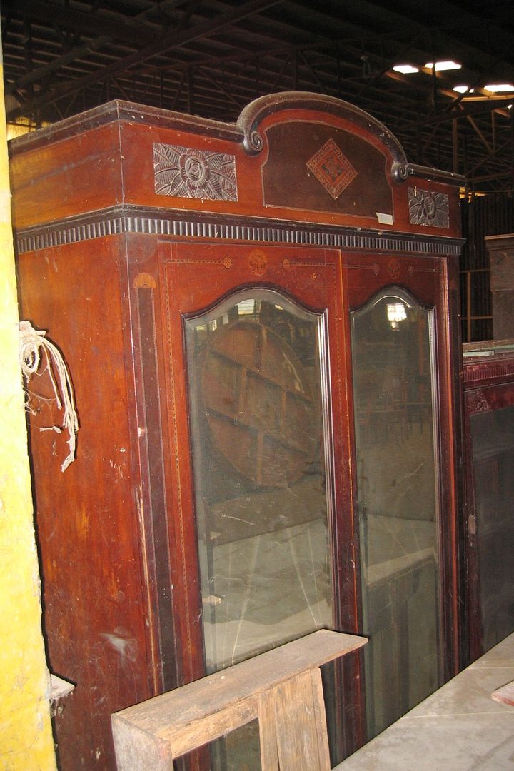
This next one is missing its ornate crown,  


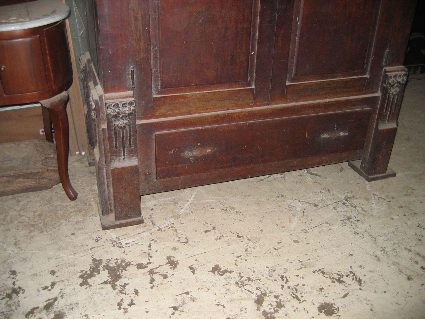
so let’s look at its characteristic feet instead: 


After restoration of the missing crown, here’s how that last one might look like: 


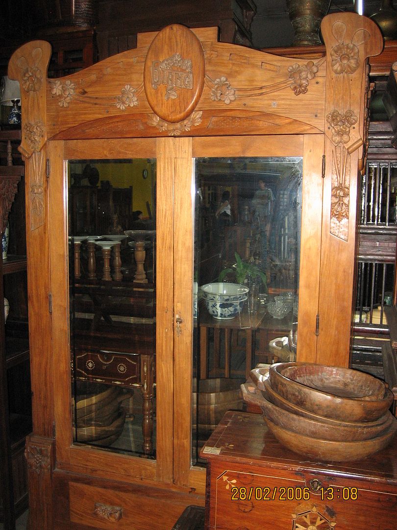
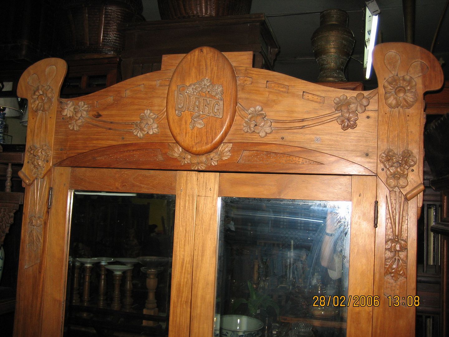
This style of Art Deco cabinet lent itself particularly well to personalization and monograms, as with this next example:   


If your name happens to be “Diang,” why not purchase this next antique piece from the dealer (or consider a name change): 


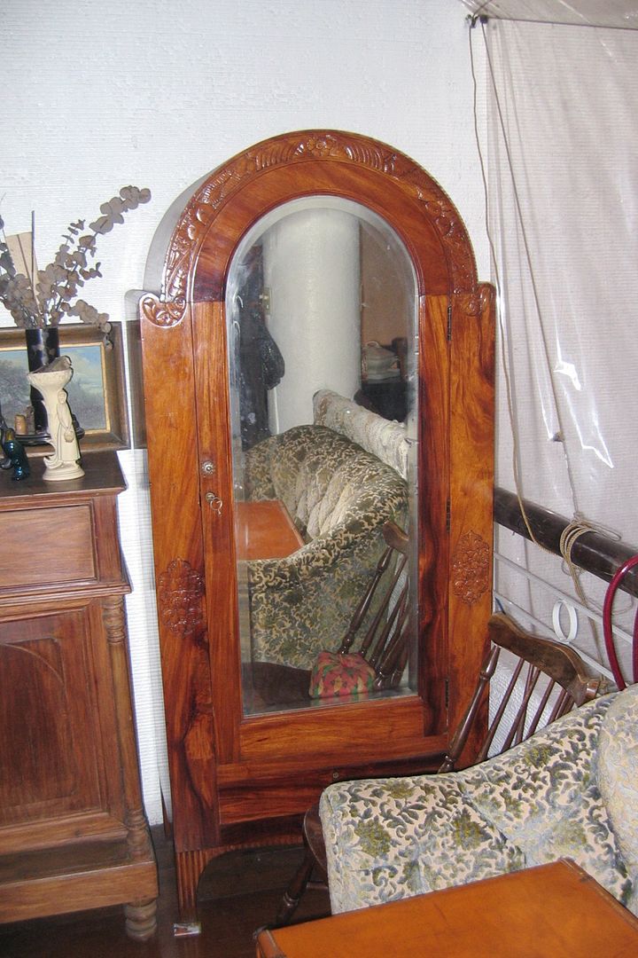
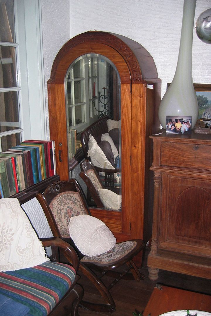
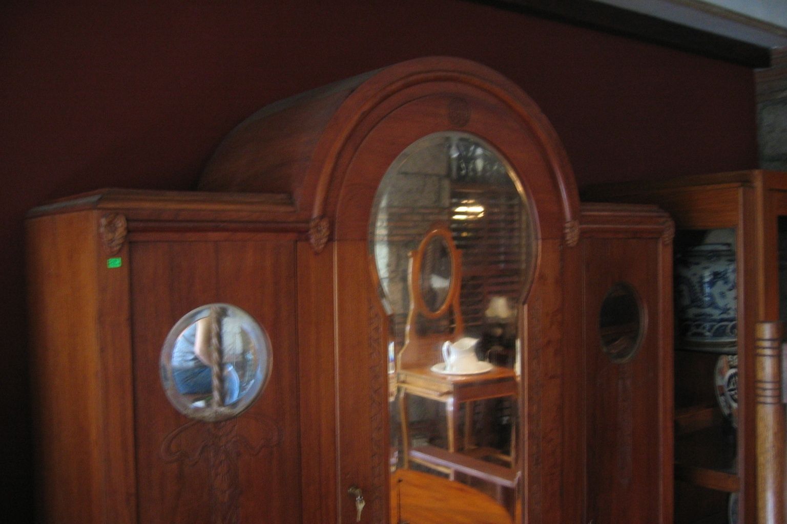
A peculiar form of aparador came into being during this Art Deco period – the “radio-type” cabinet. For those of us too young to remember what radios of the period looked like (or even to know what radios are), they were large wooden tabletop appliances with fancy lights and dials and arched tops, echoed in the designs of these aparadors, beginning with this matched single-door pair: 


Here’s a slightly-oversized single-door one: 


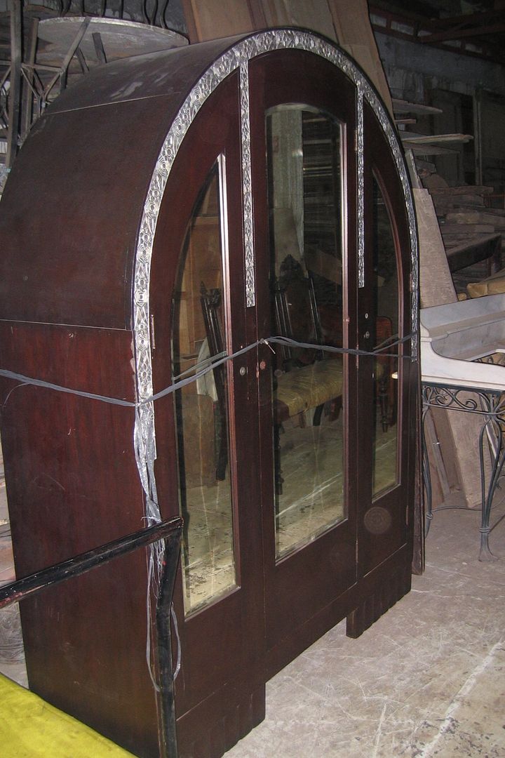
And here’s an unusual three-door radio-type aparador, which even comes with its original metal trim: 


Since we’re on the subject of three-door aparadors, I’m pleased to report that there seems to have been a lively trade in original three-door designs, all quite literally one-of-a-kind. This next one is totally unrestrained in its use of the standard elements of Art Deco design, and is only partly redeemed by its employment of unusually-shaped mirrors on the side doors. 


This next example is admirable for its simplicity and restraint, though I feel that it is lacking in height and therefore comes across as being rather of ungainly proportions: 


Here’s another simple one with an arched mirror in the middle that is echoed by arched panels on the side doors: 


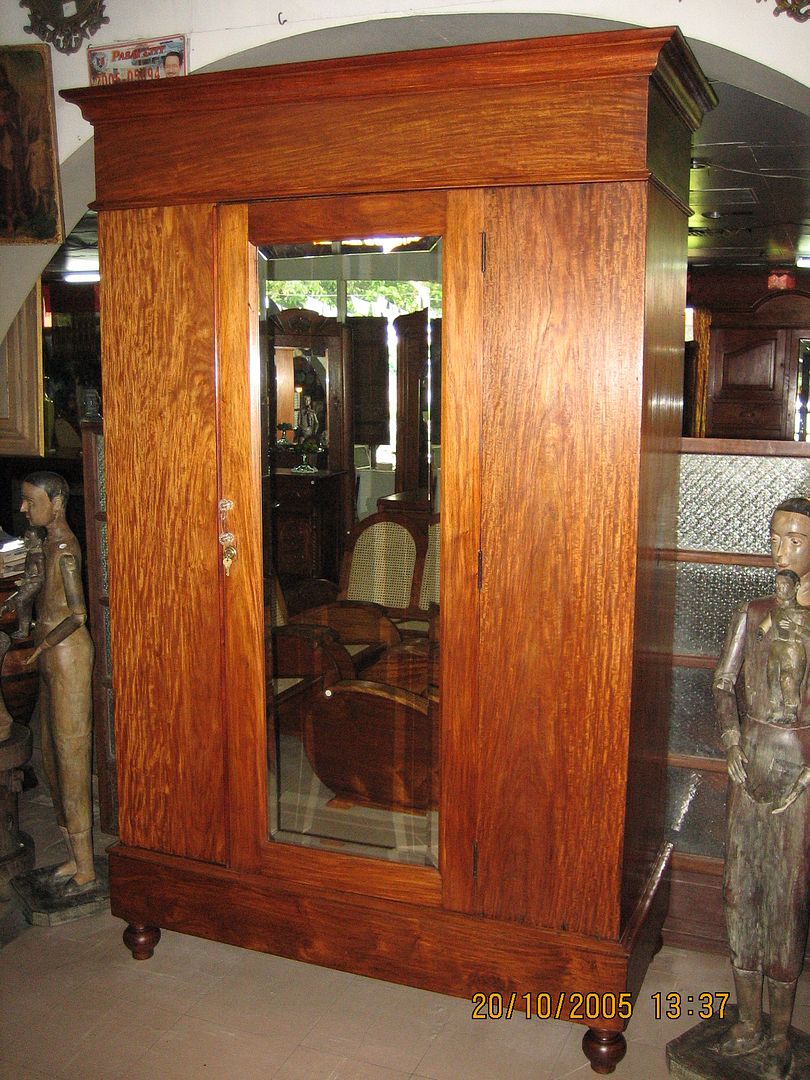
This next one doesn’t actually have three doors, just one, and is verifiably not from the 1930’s (since newspapers from 1911 were found lining its mirror while it was undergoing restoration), but I felt that its overall appearance warranted its inclusion here, at least for comparison: 


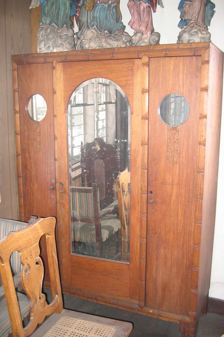
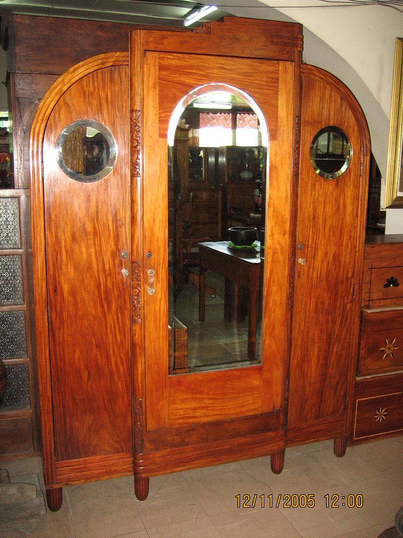
Here are three more three-door aparadors that all make use of large arched mirrors for the middle door and small round mirrors for the sides: 


Whereas this next one dispenses with the side mirrors altogether: 


The following three-door example was reputedly designed and built by a Japanese cabinetmaker in Manila in the 1930’s: 


who also made a similar two-door version: 


Probably not really antique, but definitely Neo-Art Deco (if that was possible) in its straightforwardness is this unusual construction in kamagong:


That simple overall appearance disguises its “gimmicks” (e.g., secret compartments, a false right-side door, etc.) relatively well, until one starts to use it for actual storage.


My favourite three-door specimen, however, is this next one – an unusual combination of simplicity and grandeur:


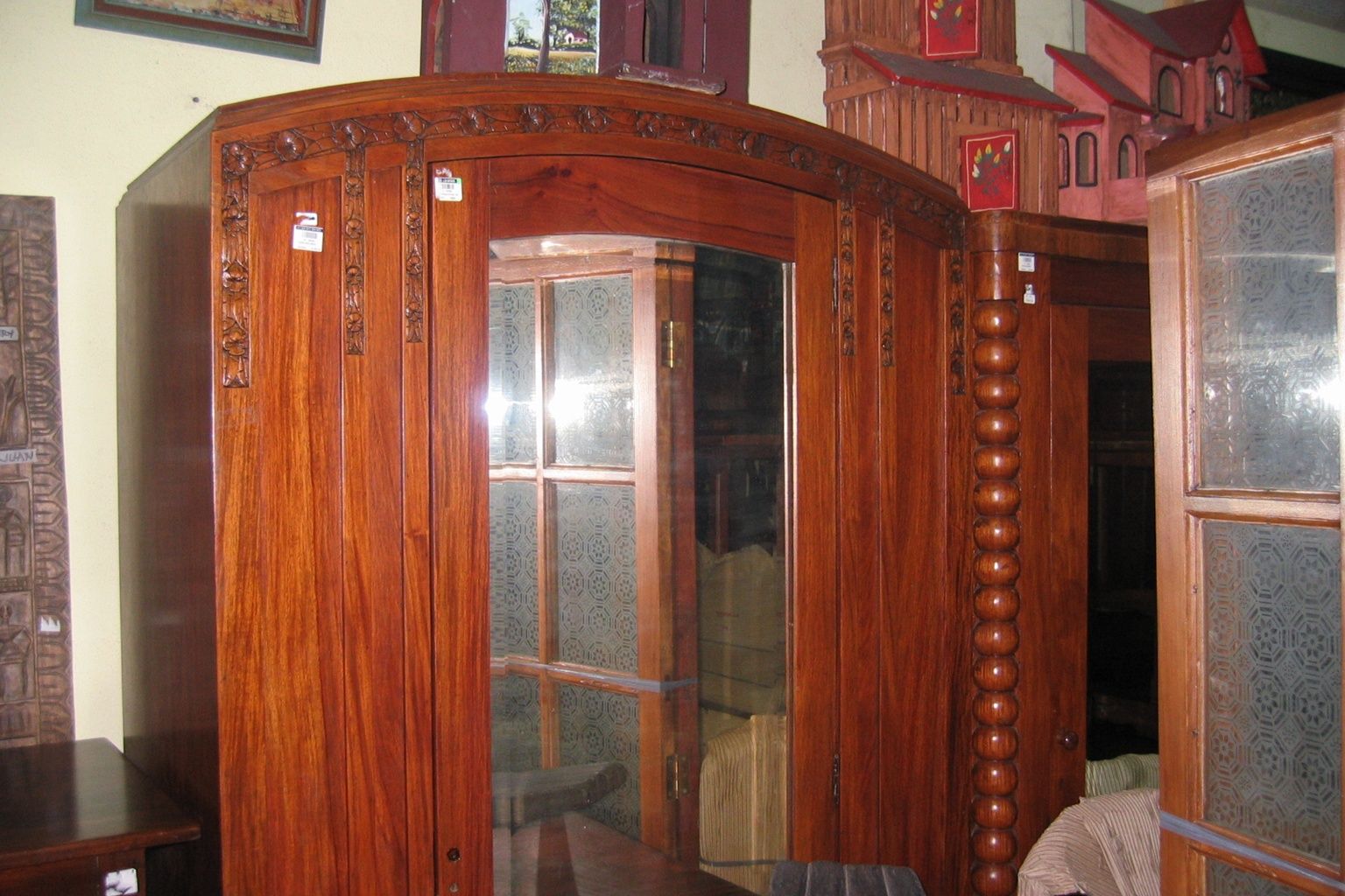
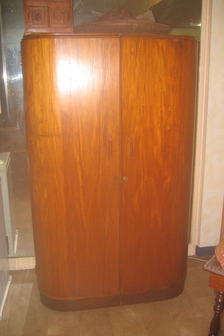
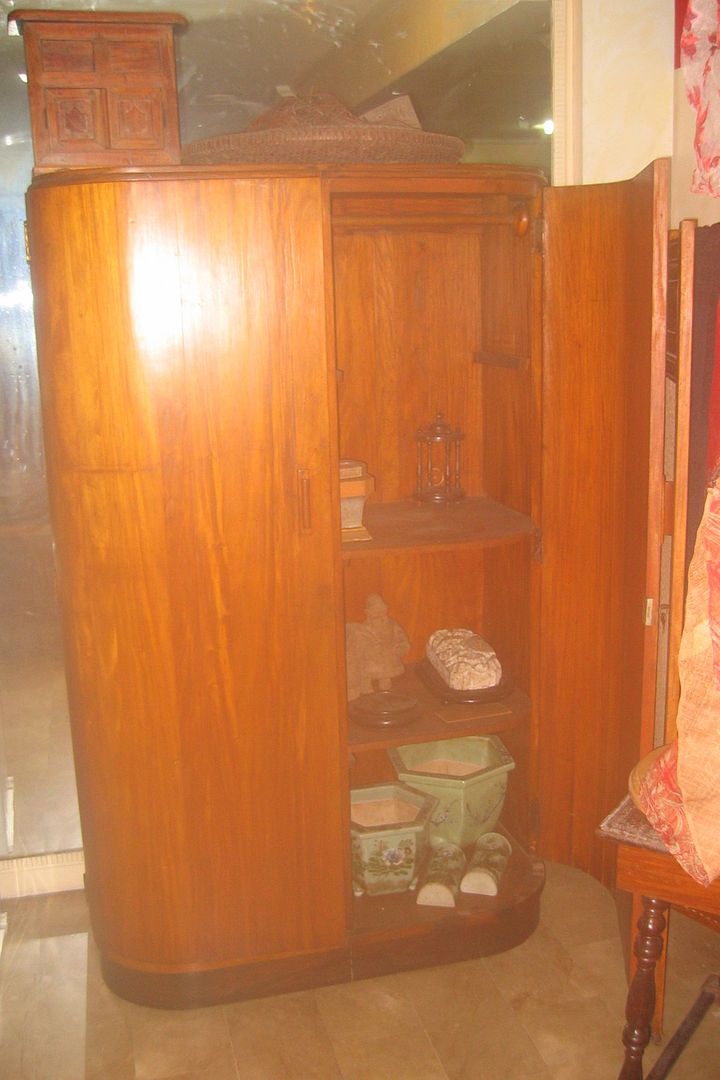
Moving on to other Art Deco aparadors that don’t quite fit under any notional sub-classification, here is a strikingly modern-looking execution with gently-curved doors: 


This next one is an unusual cabinet with specially-ordered (and therefore expensive) mirrors, and an effective faux-kamagong-and-narra finish that is actually all narra: 


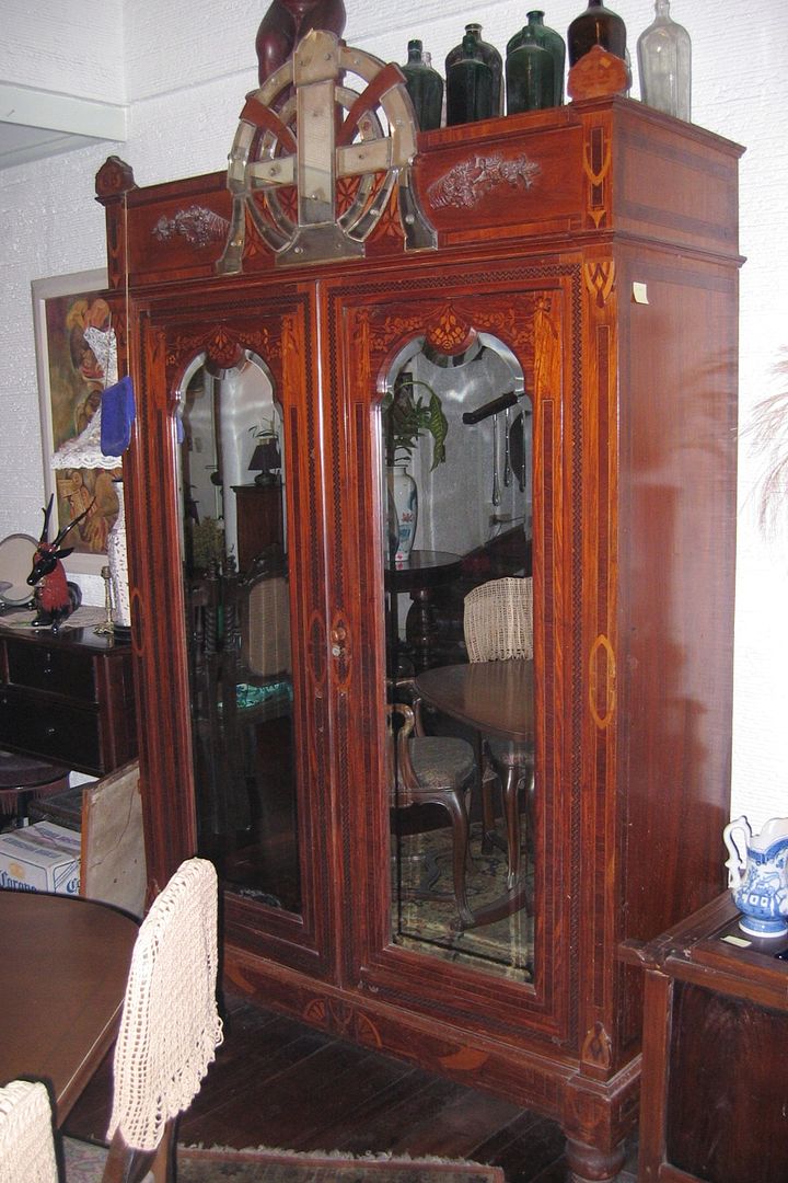
The following example could date back to the late 19th century or at least the earlier decade of the 20th century. However, its boldness and "egoism" certainly remind one of those garlanded monogrammed Art Deco examples we saw earlier, except that this one makes use of wood inlays and a complex arrangement of small mirror panels. (Is that a Marian symbol, a cross, or the owner’s monogram, I wonder?)


In contrast, the monogram on the top of this next one is in fact its only real design element, the rest of the oversized body’s flat surfaces being kept conspicuously plain: 


We’re back to pseudo-“Egyptian” Art Deco with this one, with Puyat-style inlay to frame the simple rectangular mirror: 


Which then brings us to the enduring Puyat style – stronger than ever in its Art Deco incarnation, as the following examples will attest: 


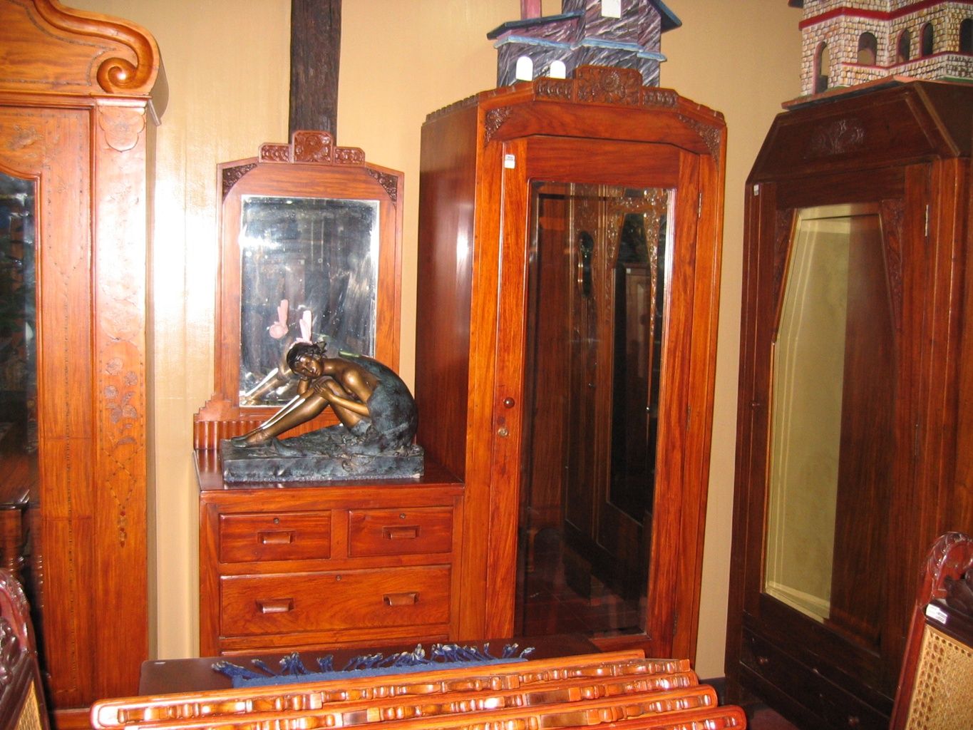
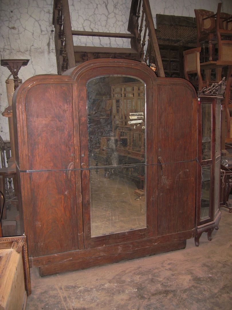
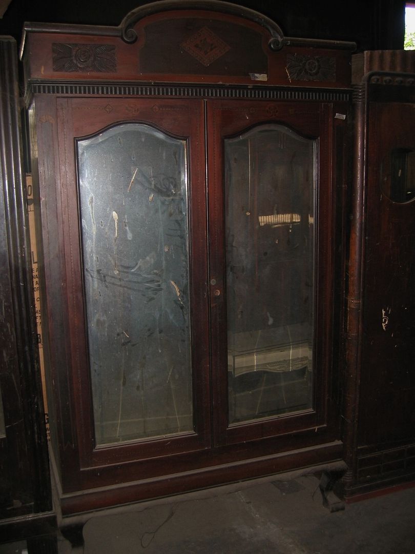
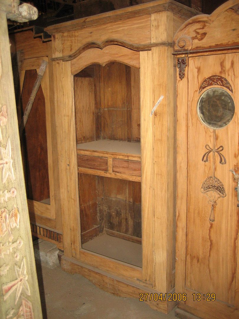
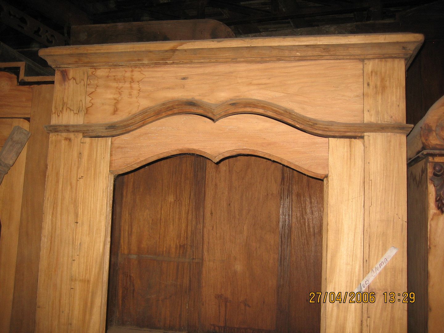
Finally, here’s a simple oversized-single-door, shown sitting in an antique furniture warehouse before restoration: 


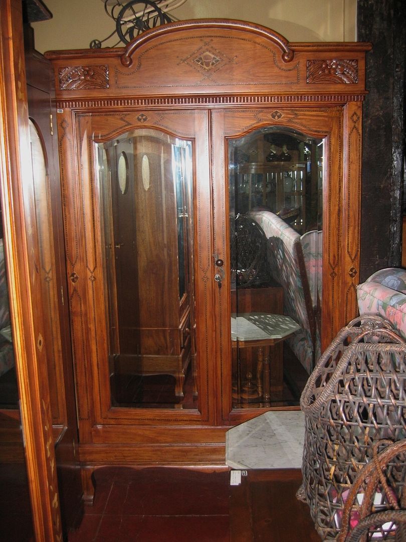
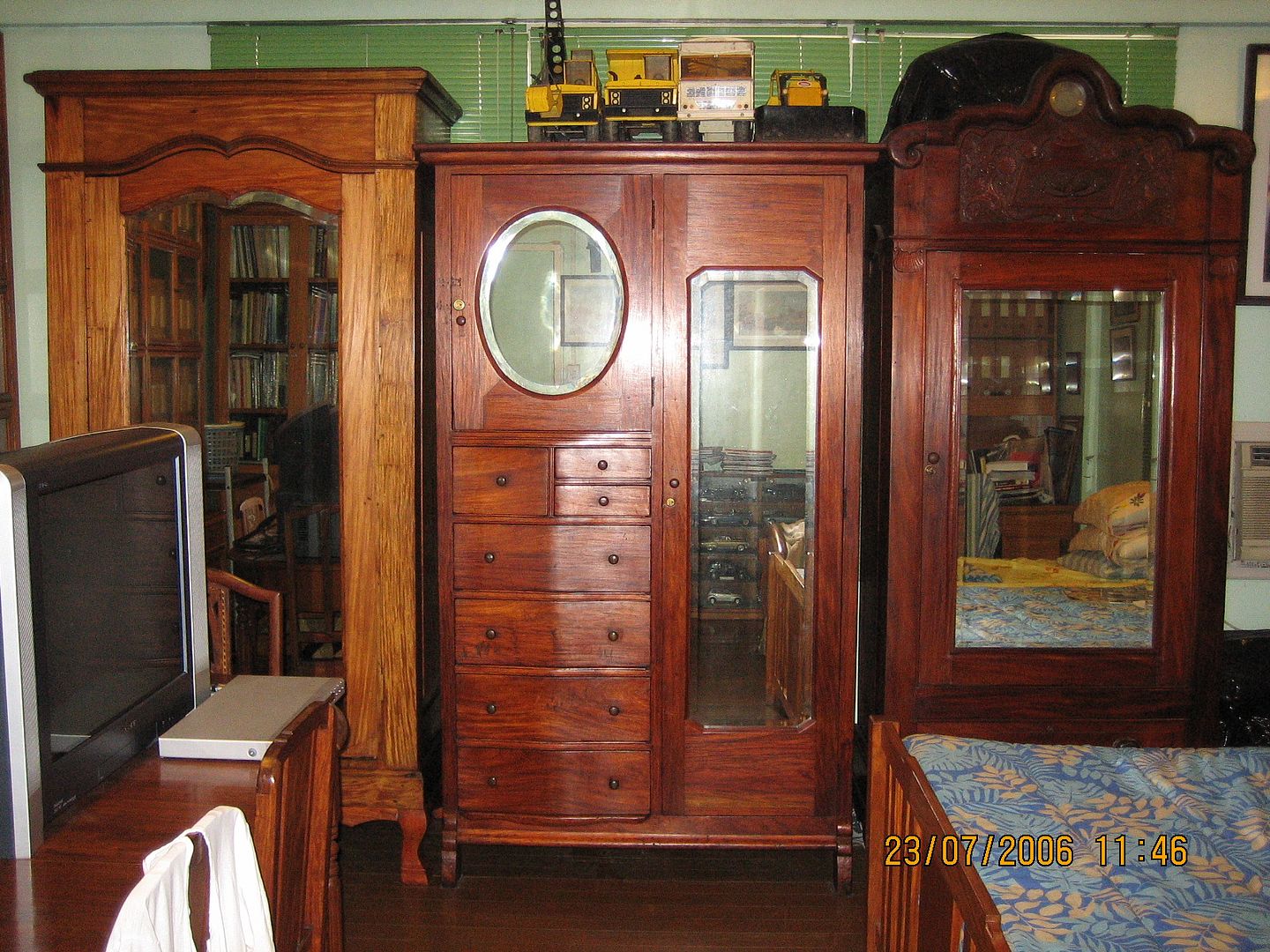
And here it is, on the left side of the next photo, completely restored, given new legs, and standing proudly alongside a different kind of “caballero” aparador (not shown previously) and the unusual all-balayong Aladdin / Lord of the Rings / Harry Potter cabinet we saw previously in its unrestored state:


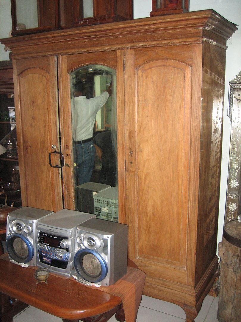
Which proves decisively that one doesn’t need their styles to match or to be from the same period to have aparadors stand together in the same room. And that as long as you place vintage all-steel Tonka trucks on top of one of them and position a top-of-the-line Sony High-Definition TV in front, it doesn’t really matter.


Originally published on 22 December 2006.  All text and photos copyright ©2006 by Leo D Cloma. The moral right of Leo D Cloma to be identified as the author of this work has been asserted.


Original comments:


mike10017 wrote on Dec 28, '06
My favorite is the one with the mirrored monogram crest and the two aparadors you shot inside the original houses. The tombstone aparadores are a pain to clean because the arched top gathers dust and it shows. The ones with the porthole mirrors are still relatively new but I think the'll soon be getting collectible status. Hope you can feature beds next time.


rally65 wrote on Dec 28, '06
"Tombstone" aparadors? That's morbid, Mike -- I've always heard them referred to as "radio-type."

Yes, the ones with porthole mirrors were made all the way into the 1950's, it seems, but I have documented proof (actual printed, dated, and published catalogues) that they were started to be made in the 1930's.


So you liked the one with a mirrored monogram? Owned by a collector-dealer, therefore for sale -- at the right (unspecified) price.


More than two of these photos were shot inside the original houses -- I guess the one you like is the one with a "duyan" hanging in the foreground, but which is the other one?


Yep, I have enough material for a feature on beds, so stay tuned to this radio (or tombstone).


mike10017 wrote on Dec 28, '06
A radio in that style was called a tombstone radio. Yes, the one with the duyan and the two-toned narra also. Not because they're really beautiful but just because they fit in the overall look of the house. I'm sure that's expensive. Unfortunately, we don't have space for another aparador at home but were in the market for a matrimonial four poster bed.


rally65 wrote on Dec 28, '06
Quite a number of antique four-poster beds in the market. Let me know your target dimensions, and I will look around for you.


mike10017 wrote on Dec 29, '06
I'm not sure about the actual sizes of beds but I want one that will fit two to three people comfortably. I don't really like the ilocos type with balustres in the headboard. I prefer them carved calado. Also, I am partial to salmonica columns for the pilaretes. An ah-tay would also be fine. Around how much is the going rate for beds these days?


rally65 wrote on Dec 29, '06
I just need to align my understanding of "technical terms" here -- I think I vaguely get what "balustres in the headboard" and "carved calado" mean, but what are "salmonica columns for the pilaretes"? Are those the same as Solomonic columns, otherwise known as "pilipit" or "lubid"? And would a plain headboard but with inlay, either a la Baliwag (i.e., carabao bone), or Puyat-style (i.e., various types of wood) be acceptable too?

Prices vary wildly, but expect to pay between USD 600 to USD 1,000 for a decent antique matrimonial bed. Good reproduction Ah Tay-style double beds go for considerably more.


A bed to fit two to THREE people? My, that's kinky, Mike! Ha! Ha!


mike10017 wrote on Dec 30, '06, edited on Dec 30, '06
HEY!!! I'm quite bigger and taller than the normal filipino when they made those beds. Three of them is equivalent to two of myself. The one in my room is quite short and I always wake up with lots of mosquito bites on my feet because they stick out of the kulambo. Yes, the pilipit columns. Salomonica pala wrong spelling. I've seen pics of beds from tiendesitas but they're built quite low to the floor. Baliwag style beds with inlaid headboards look rather plain and Puyat styles are mostly half canopies. I like the one from the Crisologo house in Vigan. By the way, Happy New Year.


rally65 wrote on Dec 31, '06
Mike, I recommend that you order a good reproduction Ah Tay-style bed, in hardwood (usually narra or ipil), with a full canopy, custom-made to your preferred measurements, both length and width. The standard height of those is pretty high off the floor, so no problem there. This won't be cheap, but it will be well worth it. Email me separately for more details if you want to pursue.


mike10017 wrote on Jan 6, '07
I prefer an original antique piece. The more haunted looking it is the better. Well, the cheaper it is the better too.


rally65 wrote on Jan 7, '07
Unfortunately all the original Ah Tay-style four-poster beds seem to be either in museums or in private collections. If any more originals ever turn up, they would certainly be even more expensive than the equivalent pricey but well-made reproductions. This is partly why my family has opted for early 20th century pieces instead -- though slightly plainer (e.g., wood inlays, half canopies) they're much less expensive, and at least they're available!